PandaText / Guides / Why Chinese and Japanese text breaks differently on each platform
Why Chinese and Japanese text breaks differently on each platform
Chinese and Japanese are written without spaces between words. A line can break between almost any two characters, except where rules forbid it, such as before a full stop or a closing bracket. The language also decides the font, because the two languages draw some of the same characters differently.
I showed the same Japanese and Chinese text on five surfaces, each in its system font: an iPhone, an Android phone, and Chrome, Safari and Firefox on a Mac. These are the three differences that were easiest to see.
1. One Japanese paragraph, three sets of line breaks
All five followed the rules: no line started with “。” or “、”. They still broke in different places. Safari fit “た。” at the end of the first line, and the other four moved it to the second. The iPhone ended the second line after “エンジニ”; Android, Chrome and Firefox ended it after “エンジ”.

The difference comes from width. Unwrapped, the paragraph was 786.5 px in Safari, 811.6 px in Chrome and 838.3 px in Firefox, so each fits a different number of characters on a line. The heights ranged from 60.0 to 76.5, with Chrome and Android the tallest.
2. The last character ends up alone
A 17-character line, “東京都の新しいプロジェクト計画を確認”, fit on one line on the iPhone and in Safari. Android, Chrome and Firefox pushed the last character, 認, onto a second line by itself. Japanese typesetters avoid a line with a single character; the default settings here did not.

The same picture shows a selection. Each surface selected the word around “新”, as a double-tap does, and all five chose “新しい”. Selecting a word in Japanese needs a dictionary, and for this common word the dictionaries of Apple, Android and the three browsers agreed.
3. Without a language tag, each surface picks its own font
Eight Han characters with no language set came out in a different font, width and height on each surface: 160.7 px wide in Chrome, 165.3 px in Safari and 172.3 px in Firefox, and between 33.0 and 41.0 tall.

The language decides more than spacing. Characters such as 骨 and 直 have different standard forms in Chinese and Japanese, and the font follows the language. Without a lang attribute, Chrome on Windows picks the font from the system locale, so a Japanese and a Chinese Windows computer show the same page differently. Set the language on the text, and keep it with the text wherever it is measured.
Features only some platforms have
Only Chrome supports word-break: auto-phrase, which breaks Japanese at phrase boundaries, and text-spacing-trim, which trims the space around CJK punctuation. Safari 27 changed where Korean text with word-break: keep-all breaks after punctuation. Android 13 added opt-in phrase-based breaking for Japanese, and since iOS 17, improved line breaking for Chinese, Japanese and Korean applies only to text that uses text styles.
Keep selection and line breaks in one layout
If each platform picks the line breaks and the word boundaries, a highlight made on one device can cover a different span on another after sync, and a character can move to the next line. The stored range is still two offsets, but they no longer point at what the reader saw.
PandaText keeps layout and selection together on every platform it ships, including Chinese and Japanese. The IME still comes from the platform. Here is the Japanese paragraph from the first test in PandaText, with the same Noto Sans JP font on all six surfaces. It breaks into the same three lines everywhere.

How I tested
Two small apps showed the text in UITextView on an iPhone 18 Pro simulator (iOS 27.0) and TextView on a Pixel 10 Pro emulator (Android 17), and a test page showed it in Chrome 156, Safari 27.0.1 and Firefox 159 on a Retina Mac (macOS 27.0.1), in October 2026. Each used its system font at 17 pt, dp or px (28 for the Han characters) in a box 300 wide. The web page set lang="ja" on the Japanese text and no language on the Han characters. Word selection used each platform's own word boundaries: the UIKit tokenizer, ICU on Android, and the browser's selection API.
Compare CJK layout and selection across platforms
- Write a small fixture. Include a paragraph with punctuation, a short line that nearly fills the width, and a name or rare term. Set the language.
- Compare line breaks. Open it on every platform you ship and write down the first character of each line and the height of the paragraph.
- Double-tap a word. Copy the selection on each platform and compare the strings, not the screenshots.
- Remove the language. Repeat without a language tag and compare the fonts. Readers whose system language differs from yours will see that version.
Questions
Can a shared dictionary file fix selection?
It removes one source of drift for word ranges, though in this test all five surfaces already selected the same common word. Line breaks, fonts and widths still differed, so they have to come from the same engine too.
Why does a page without a lang attribute look different in Chinese and Japanese?
Chinese and Japanese draw some of the same characters in different forms, and the browser picks the font from the language. Without lang, the font depends on the platform and, on Windows, on the system locale.
Sources
- Chrome for Developers: Improved font fallbacks
- MDN: word-break
- MDN: text-spacing-trim
- Safari 27 release notes
- Android Developers: Style paragraph in Compose
- WWDC23 notes: text styles and line height
Related guides
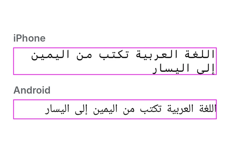
How Arabic and English share one line
Arabic and English on one line, on iPhone, Android, Chrome, Safari and Firefox. Same order and breaks, but different fonts, heights and spacing.
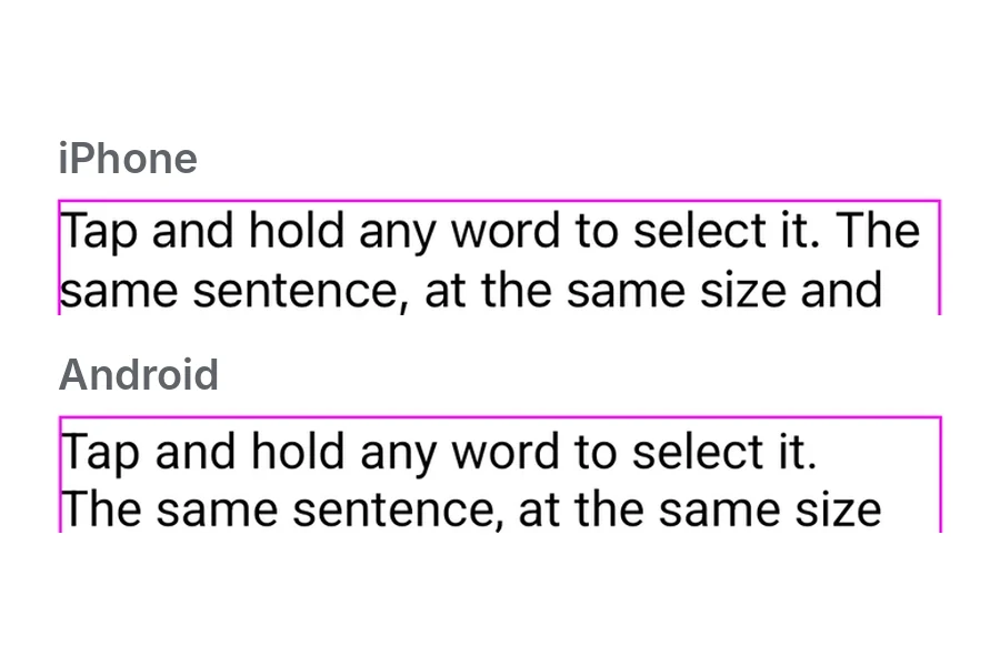
Why the same text wraps differently on iOS and Android
One sentence on an iPhone and an Android phone, same size and width. The system font, emoji and line height each changed the result.