PandaText / Guides / Why the same text wraps differently on iOS and Android
Why the same text wraps differently on iOS and Android
We put the same sentence on an iPhone and an Android phone: the same words, at 17 points, in a box 300 points wide, in each platform's standard text view. The two phones ended the first line on different words.
These are the three differences that were easiest to see. The screenshots come from an iPhone 18 Pro simulator on iOS 27.0 (UITextView) and a Pixel 10 Pro emulator on Android 17 (TextView), taken in October 2026. iOS sizes are in points and Android sizes in dp; on both devices one unit is 3 pixels.
1. The system font moves words to another line
In the system font, the iPhone keeps “The” at the end of the first line. Android moves it to the second line, so every later line starts on a different word. Both paragraphs are four lines, 81.3 pt and 81.7 dp tall, so neither looks broken. It is simply a different paragraph.

The cause is the font. iOS draws its system font in San Francisco and Android in Roboto, and their letters have different widths. When both apps used one bundled font file, Noto Sans Regular, all four lines broke on the same words on both phones.

The heights still differed by 2.3 points. Android's TextView adds font padding above the first line and below the last by default. With includeFontPadding off, the Android paragraph was 93.3 dp, within 0.6 of the iPhone. A shared font file fixes the words, not the spacing.
2. Emoji look different and take different space
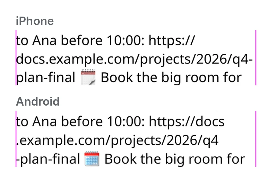
Emoji come from each system's emoji font: Apple Color Emoji on iOS and Noto Color Emoji on this Android phone. The pictures differ, and so do their widths. Android fit nine emoji on the first line and the iPhone fit eight, so the phone emoji ends line 1 on Android and starts line 2 on iOS.

A bundled text font does not help, because few apps ship their own emoji font. In chats, notes and comments, emoji are common enough that this alone moves lines between phones. Phones from other makers can ship their own emoji font, which adds a third version.
3. Thai and Arabic lines are taller on Android
On the iPhone, an English, a Thai and an Arabic sentence were each 40.7 pt tall for two lines. On Android the English sentence was 42.3 dp, the Thai sentence 47.0 dp and the Arabic sentence 58.0 dp, 43% taller than on the iPhone. The Thai and Arabic sentences also broke after different words.

The cause is a TextView setting, fallbackLineSpacing, which was on by default in the test app. When a line uses a fallback font, here the system fonts for Thai and Arabic, Android makes the line tall enough for that font. With the setting off, all three sentences were 42.3 dp tall, like the English one. The Thai and Arabic line breaks still differed from the iPhone.
Android also has elegantTextHeight, which picks taller forms of scripts such as Thai and Arabic. Android 15 turned it on by default, and Android 16 ignores the setting for apps that target it, so the taller forms are now always used. iOS has its own rule: since iOS 17, text set with text styles gets extra line height when the user's preferred languages include Thai or Hindi. This test used a fixed system font, so that rule did not apply.
When the line break is part of the document
A short label can grow or take a second line. A note, a chat message or a text box on a canvas cannot. A comment, a highlight or handwriting pinned to a word needs that word to stay in place when the file opens on another phone.
PandaText is a rich-text editor SDK for that case. It lays the text out once and draws those lines on iOS, Android, macOS and the web, and leaves scrolling, the keyboard, gestures, selection, the IME and accessibility with the platform. Here is the first test sentence in PandaText, with the same font files on both phones, on the Mac and in three browsers. Every line ends on the same word.

The guide on shared line breaks lists what one engine has to own.
How we tested
Two small apps show the same strings in UITextView on iOS and TextView on Android, at 17 pt and 17 sp, in a box 300 points or dp wide, in the system font unless noted. Each app records its own line breaks and heights; the numbers under each box come from the views. The Android app targets SDK 36, and all settings are the platform defaults unless noted.
These are a simulator and an emulator, not physical phones. They use the same system fonts as the devices, but phones from other makers can ship different fonts and emoji, and UILabel, SwiftUI and Jetpack Compose can lay text out differently from the views tested here.
Check an iOS and Android wrap mismatch
- Freeze the inputs. Keep the string, the font size and the width in points the same on both phones.
- Mark the second line. Write down the first word of line two and the height of the paragraph on each phone.
- Swap in one font file. Bundle the same font file in both apps. If the breaks now match, the system fonts were the cause. Check the height separately.
- Add emoji and other scripts. Repeat with a line of emoji and a Thai or Arabic sentence. These come from system fonts even when your text font is bundled.
Questions
Does one font file make iOS and Android wrap the same?
In this test it did for an English paragraph: with Noto Sans bundled in both apps, all four lines broke on the same words. The heights still differed by 2.3 points, and emoji and scripts your font lacks still come from each system.
Does this only show up in React Native?
No. This test used UITextView and TextView directly. React Native passes one style object to these two native text stacks, which makes the split easy to see.
Sources
- Android Developers: TextView.setFallbackLineSpacing
- Android Developers: TextView.setIncludeFontPadding
- Android 15 behavior changes
- Android 16 behavior changes
- WWDC23 notes: text styles and line height
Related guides
How to keep the same line breaks on iOS, Android and the web
One note with one font file broke four ways on iPhone, Android, Chrome, Safari and Firefox. What a shared engine has to own to fix that.
How to measure text the same way on every platform
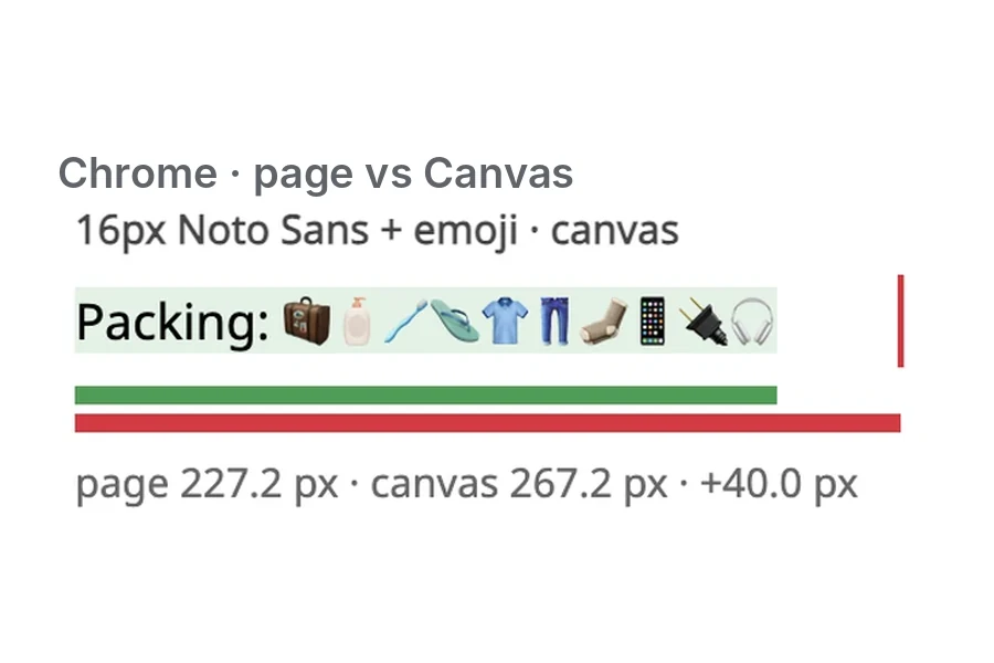
Canvas measureText() was off from the page by up to 50 px in Chrome and Firefox. Why one engine should return the width, line breaks and carets.