PandaText / Guides / How to keep the same line breaks on iOS, Android and the web
How to keep the same line breaks on iOS, Android and the web
We wrote one short note, the kind people keep in a notes app, and showed it on five surfaces: an iPhone, an Android phone, and Chrome, Safari and Firefox on a Mac. All five used the same bundled font file, Noto Sans, at 17 points in a box 300 points wide. The note broke into lines four different ways, and no two surfaces gave the same height.
Sharing the font, the text and the width is not enough. Each surface still runs its own text engine, and each engine spends the width differently. You get the same line breaks only when one engine chooses them and every surface draws that result.
What changed between the five
Four of the five ended the first line after “plan”; Firefox fit “to” as well. The link is where they split apart. The iPhone and Firefox broke it after “https://” and inside “q4-plan”. Android broke it before “.example” and before “-plan”, so two of its lines start with punctuation. Chrome and Safari moved the whole link to a new line and split the year 2026 into “2” and “026”.

Heights differ even where the breaks match. Chrome and Safari broke the note the same way, but Safari's lines with emoji were taller, so its paragraph was 127.0 px against Chrome's 116.5 px. Across the five surfaces the height ranged from 116.0 to 127.0.
The articles on iOS and Android and on Chrome, Safari and Firefox take these differences one at a time.
A WebView on every platform is still three engines
A common plan is to edit in a WebView, save HTML and render that HTML everywhere. The tags survive the trip; the line breaks do not, because the browser engine decides them at paint time. Every browser on iOS uses WebKit. Chrome and the system WebView on Android use Blink. Firefox on the desktop uses Gecko.
Those engines disagree on their own. In the note above, Chrome and Safari matched on line breaks but not on height, and Firefox broke the link in another place.
Per-platform fixes expire
The other common plan is to keep each native text view and patch the differences. The target moves with each release. Chrome's line-break data changed on 239 code points between versions 147 and 153. Chrome 149 stopped applying letter-spacing to Arabic and other cursive scripts. Safari 27 changed where Korean text with word-break: keep-all breaks. Android 15 made Thai and Arabic lines taller by default, and Android 16 ignores the setting that turned that off.
Some differences are allowed by the specs. CSS leaves the text-wrap: balance and pretty algorithms, and hyphenation dictionaries, to each browser. No engine is wrong when they disagree, so there is no bug to wait for.
What one engine has to own
Every step that can move a line break. The font files, with fallback fonts for each script you support and an emoji font. One shaping engine, such as a pinned HarfBuzz compiled to WebAssembly for the web. One version of the Unicode line-break data, with dictionaries for Thai, Lao, Khmer and Myanmar, and one rule for breaking inside URLs. Bundled hyphenation dictionaries, or none.
Then the numbers: one width unit and one rounding rule that do not depend on the screen or zoom, and an explicit choice of font metrics for line height. The result travels as line breaks, line heights and caret rectangles. The measurement guide covers why a width alone is not enough.
Keep old documents stable
An engine upgrade can move lines too. Record the engine, data and font versions with each document, so an old file lays out the same after an update. Store the start offset of each line for a set of test paragraphs, like the note above, and check them on every platform in CI. A changed offset is a changed line, caught before a user sees it.
The same note in PandaText
PandaText measures and draws with the same layout on iOS, macOS, Android and the web. On the web the layout runs as WebAssembly, so Chrome, Safari and Firefox paint lines it has already chosen. Scrolling, the keyboard, gestures, selection, the IME and accessibility stay with the platform.
Here is the note from the top of this guide in PandaText, with the same Noto font files on all six surfaces. It takes five lines everywhere, and the link breaks after “projects” on each.

How we tested
The note was laid out in UITextView on an iPhone 18 Pro simulator (iOS 27.0), in TextView on a Pixel 10 Pro emulator (Android 17), and in Chrome 156, Safari 27.0.1 and Firefox 159 in normal windows on a Retina Mac (macOS 27.0.1), in October 2026. All used Noto Sans Regular at 17 pt, dp or px in a box 300 wide, with the default line height and overflow-wrap: break-word on the web. Each surface reported its own line breaks and height.
Keep one set of line breaks across platforms
- Pick a real test note. Use text your users write, with emoji, a link and any scripts you support, at the column width they get.
- Record every line. Open it on iOS, Android and each browser you support, and write down where each line starts and how tall the paragraph is.
- Stop sharing only the HTML. If the lines differ, the text travels and the breaks do not. A WebView does not fix that, because each engine still wraps at paint time.
- Pin and test one layout. Let one engine choose breaks, heights and caret rectangles, pin its data versions, and check line-start offsets on every platform in CI.
Questions
Does a monospaced font make the breaks match?
It removes proportional widths for Latin text. Emoji, links, hyphenation, fallback fonts for other scripts and line-height rules still differ, and a monospaced face does not help Chinese or Arabic.
Can the server send the line breaks?
Yes, if the server runs the same layout engine the clients draw with, at the same width and with the same font files. A server that wraps with a browser you do not ship will disagree with the phones.
Sources
- Pretext issue #321: native text layout emulation (Cheng Lou)
- MDN: text-wrap
- MDN: overflow-wrap
- Safari 27 release notes
- Android 15 behavior changes
- Android 16 behavior changes
Related guides
Why the same text wraps differently on iOS and Android
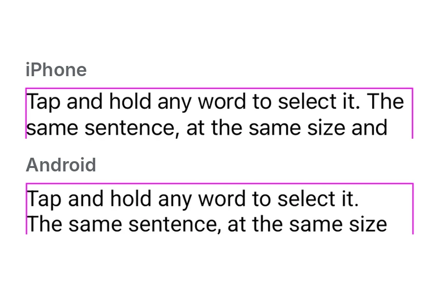
One sentence on an iPhone and an Android phone, same size and width. The system font, emoji and line height each changed the result.
Why the same paragraph wraps differently in Chrome, Safari and Firefox
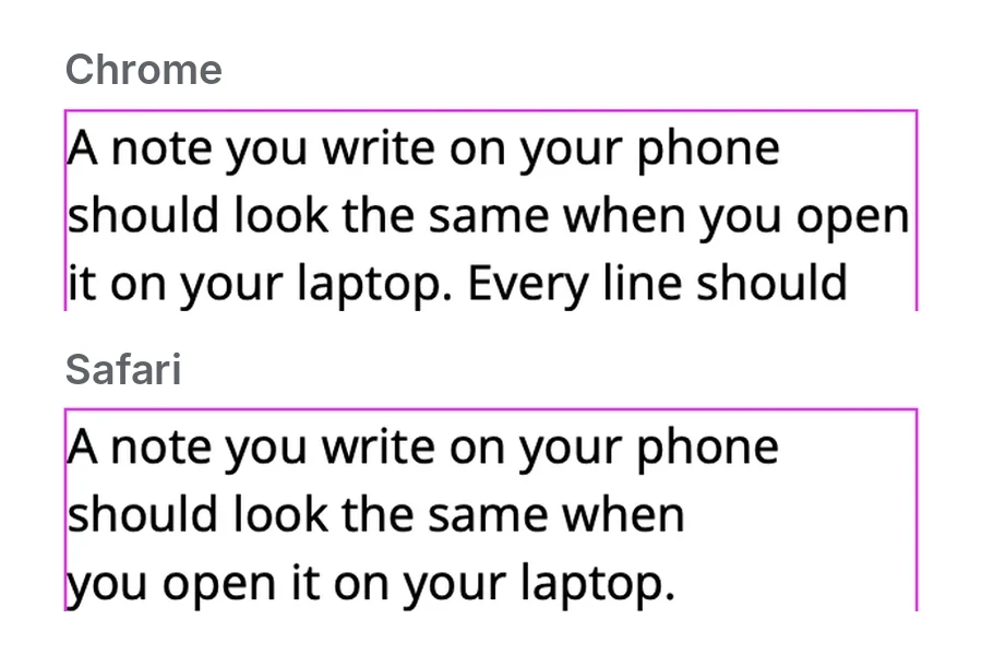
The same text in Chrome, Safari and Firefox on one Mac. text-wrap: pretty, emoji and long URLs each produced different line breaks.